Singpass Design System
Design infrastructure serving 5M+ users.
Role
Product Designer
Duration
Ongoing
Outcome
· Unified design across app and web platforms· Aligned visual language for 4 web products
Background
In 2021, the Singpass app underwent a rebrand in tandem with the digital NRIC launch. The design system needed to evolve to support this new visual direction and scale across growing product needs.
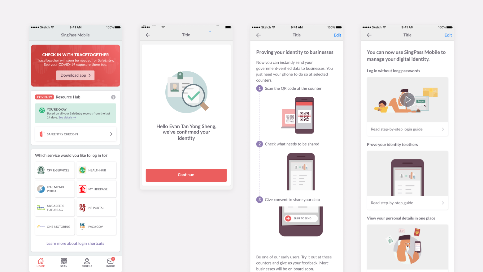
Singpass app from 2018–2020
Singpass updated visual direction in 2021 onwards
I joined the team during this transition and observed how the team established the updated visual direction and engineering best practices. When several design team members left, I stepped up to extend and maintain the system.
What I built
Color token system
Created a comprehensive token structure that cleanly mapped to engineering code, supporting both light and dark modes with consistent implementation across platforms.
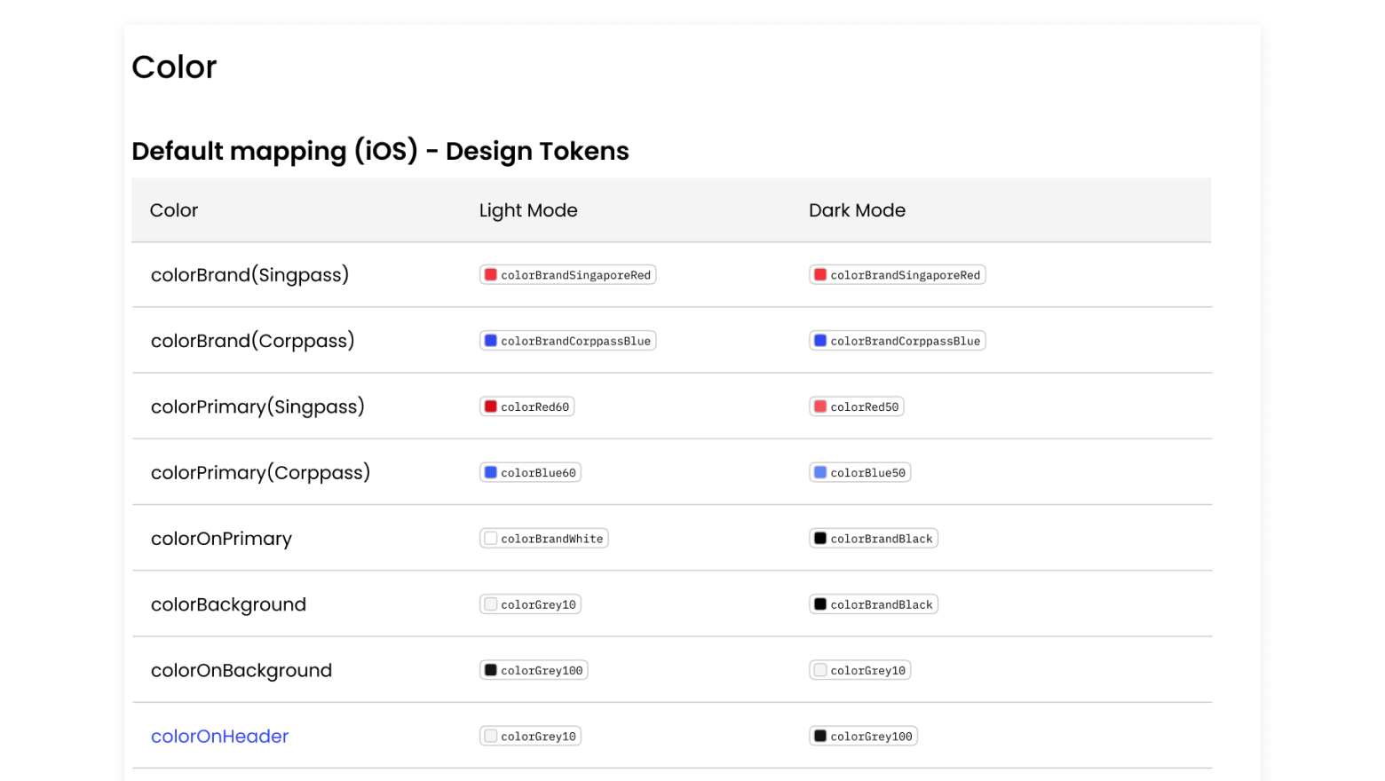
Singpass app colour tokens
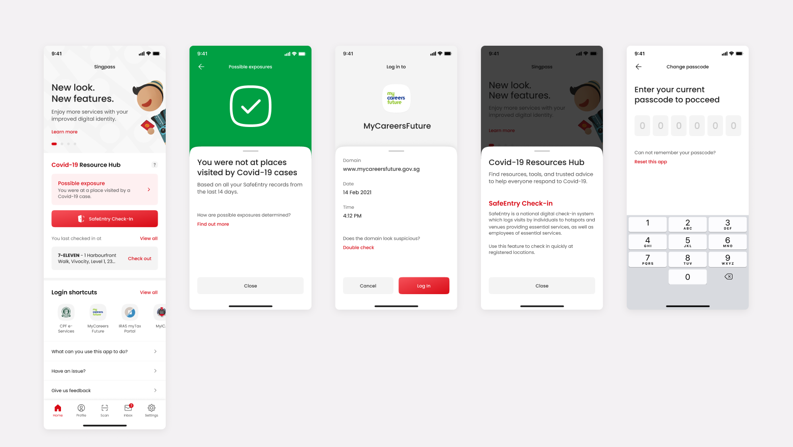
Responsive components
Designed new components with built-in responsiveness, ensuring consistent experiences across different screen sizes and devices.
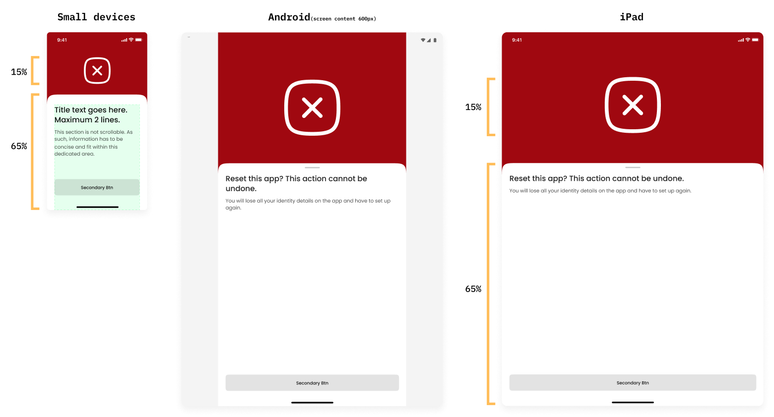
Defining drawer heights in percentages instead of pixels
Platform-specific components
Built separate component libraries for iOS and Android, respecting each OS's native patterns and interaction models while maintaining visual consistency.
Tackling Web Fragmentation
The Singpass app had a cohesive system. The web products didn't. User portal, developers' portal, Corppass, and Findex were each built on different libraries by different designers, creating inconsistency and technical debt. During a management change, I stepped up to align them.
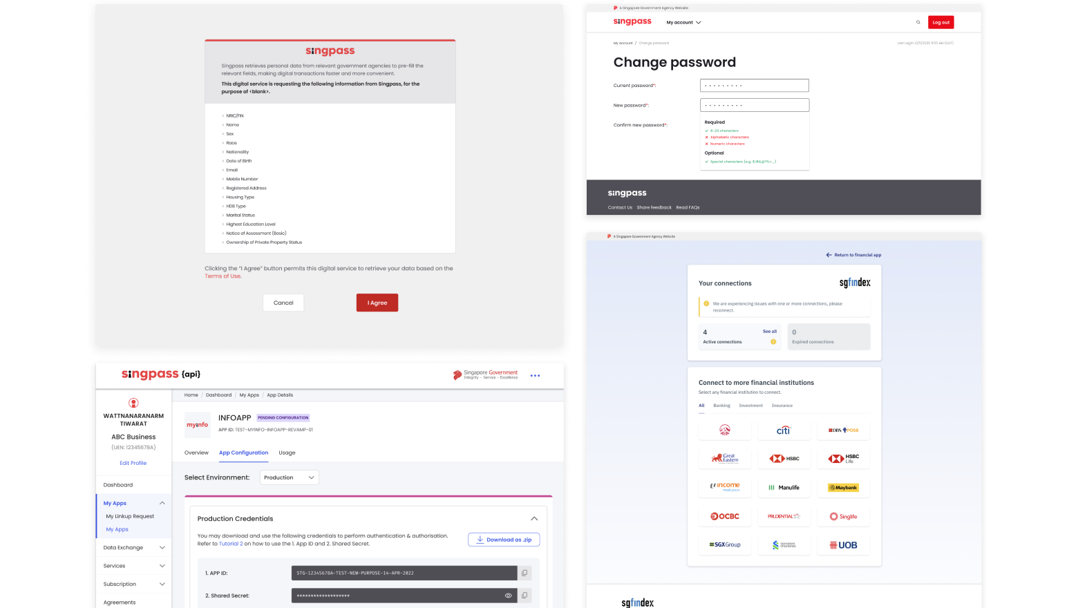
4 products, 4 visual languages
Singpass Web Design System
Building the Foundation
Trustworthy yet approachable
We handle citizens' most sensitive data. Design must earn that trust while staying approachable.
Clear and functional
Reduce cognitive load in high-stakes moments.
Accessible and inclusive
Serve all Singaporeans regardless of ability.
Modern and confident
Signal the future of digital identity, not legacy government tech.
My approach
· Started with the Singpass brand guide (human, trustworthy, empathetic) as foundation
· Audited existing color palettes for contrast ratios and accessibility
· Mapped visual traits across all Singpass products, identifying where they aligned and diverged
· Studied government digital services globally, fintech apps, and authentication products to understand how they achieved similar goals
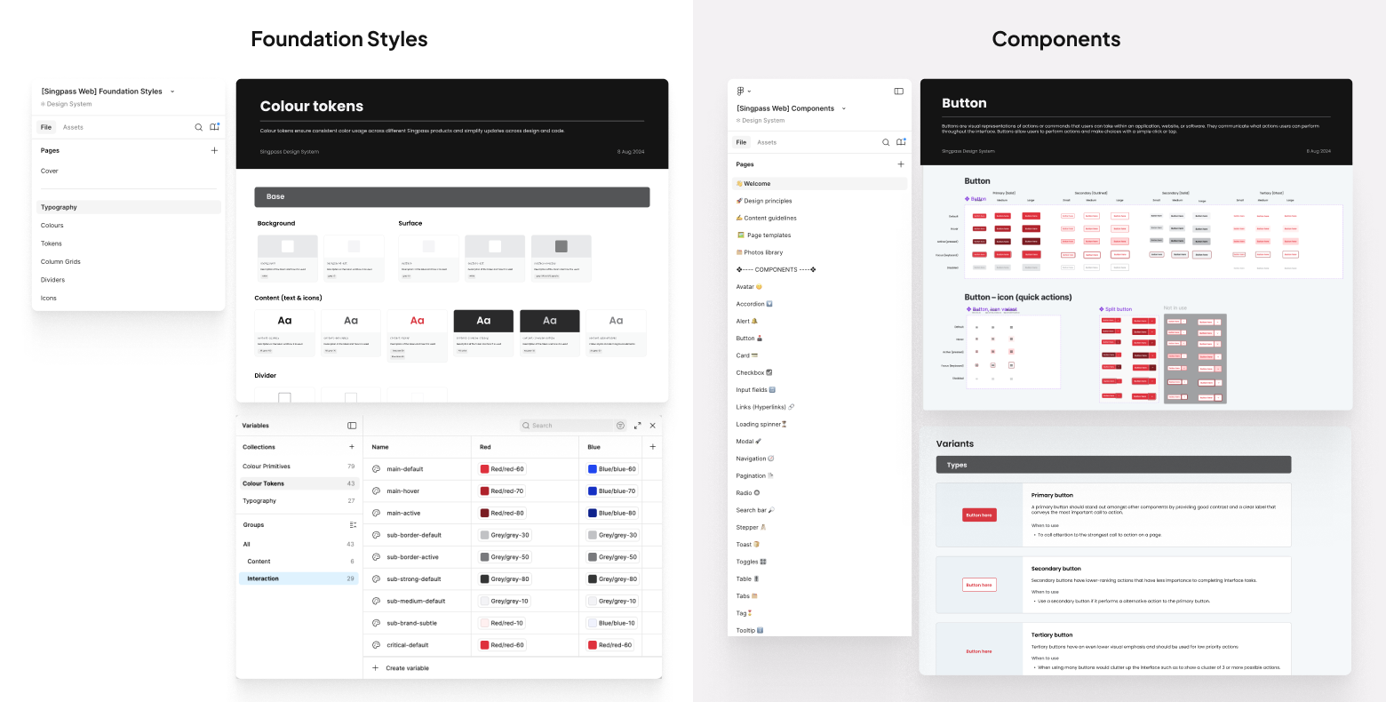
What I built
Color system
79 color primitives and 43 semantic tokens that mapped cleanly to code.
Typography scales
Clear hierarchy for content organization.
Components library
Starting with buttons across multiple variants (primary, secondary, tertiary) and states.
Core principles
Generous white space for calmer experiences, structured layouts for credibility, better contrast that felt less stark.
Working with 2 other designers, I created a system that could scale across products while maintaining that "trustworthy yet human" feeling.
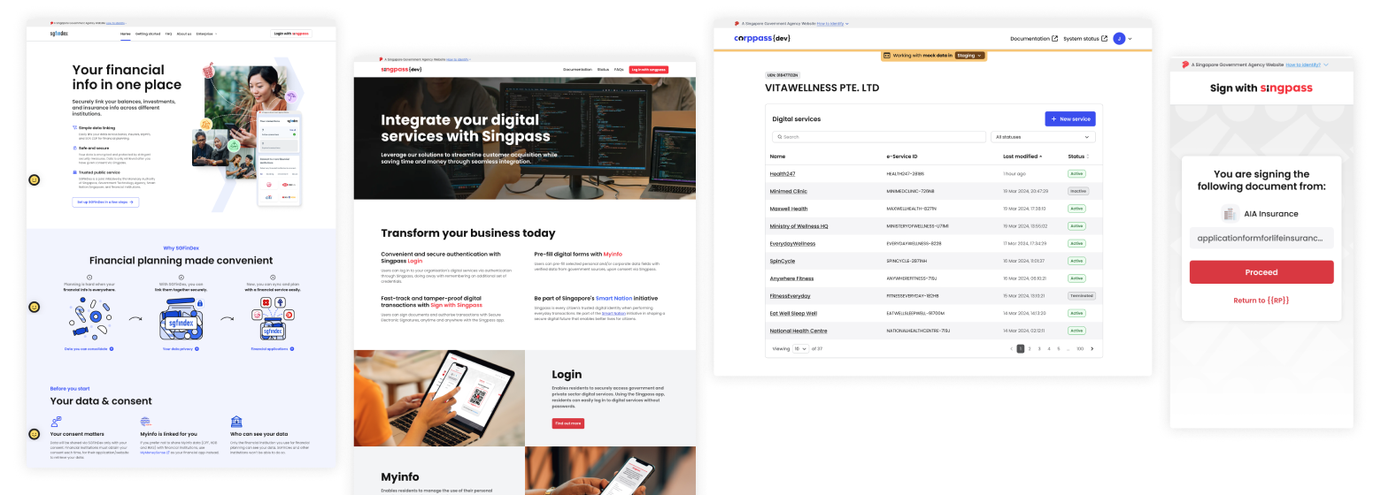
Unified design language